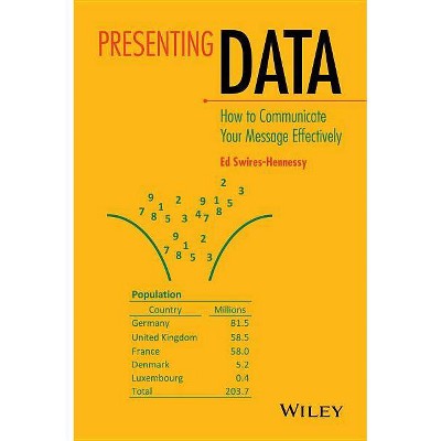
Presenting Data: How to Communicate Your Message Effectively - by Ed Swires-Hennessy (Hardcover)
Similar Products


Products of same category from the store
All


Product info
<p/><br></br><p><b> About the Book </b></p></br></br>"Presenting Data provides an easy-to-understand guide to the basic principles of data presentation and their application without the need for prior statistical training. Following the theory of each technique, poor examples are presented and analyzed, lessons drawn and principles explained and summarized along with a concluding set of good examples. A vast range of tables, charts, maps, text and data visualization are presented to illustrate errors as well as possible solutions to difficult presentational issues; throughout the book the main focus is on getting the correct message from the data. The final chapter deals with data visualization - or 'live' demonstrations of data characteristics on the internet"--<p/><br></br><p><b> Review Quotes </b></p></br></br><br><p>ÂHighly recommended to a very wide audience.ÂÂ (<i>Mathematical Association of America</i>, 1 January 2015)</p> <p>ÂPresenting data is, of course, more than a good table or an informative graphic. The words that describe the data must also be correct, clear, concise and consistent, and the author devotes a chapter to ensuring that the expertÂs hard work is not undone by commentary that is too technical or too laboured to be understood by non-expert audiences.ÂÂ (<i>The Royal Statistical Society</i>, 1 February 2015)</p> <p>ÂThis book must be mandatory to any data analyst and statistician, and indeed anyone who presents numeric data. The word numeric is important, as non-numeric data are not discussed in the book.ÂÂ (<i>ENBIS News</i>, 10 December 2014)</p> <p>ÂThe words that describe the data, and the messages it may have, must also be correct, clear, concise and consistent, and the author devotes a chapter to ensuring that the expertÂs hard work is not undone by commentary that is too technical or too laboured to be understood by non-expert audiences.ÂÂ (<i>Significance</i>, 1 February 2014)</p> <p>The book is easy to read and can be consumed in a single train journey. It is also easy to look at and the illustrations and graphics occupy as much space as the text. The author has indeed put his money where his mouth is and the graphics both illustrate his points and makes them alone. The highlight for me was in the chapter on tables where the author reduces a table containing seven columns and five rows to a two by two table which beautifully makes the point when previously it had been lost in a forest of figures...</p> <p>This is an excellent book and I would recommend it as essential reading to anyone who is writing a thesis or dissertation, making a presentation or writing a paper. ThatÂs all of us. (<b>Occupational Medicine, 15th February 2016<b>)</p><br><p/><br></br><p><b> About the Author </b></p></br></br><p><strong>Ed Swires-Hennessy</strong>, Statistical Consultant, UK<br />Ed Swires-Hennessy was a government statistician until his retirement in 2010. His teaching on statistical presentation has continued and he currently delivers a one day course on Presenting Data for the Royal Statistical Society (RSS). In 2003 he was awarded the RSS JH West medal for outstanding contribution and influence on the dissemination of official statistics.
Price History
Price Archive shows prices from various stores, lets you see history and find the cheapest. There is no actual sale on the website. For all support, inquiry and suggestion messages communication@pricearchive.us